


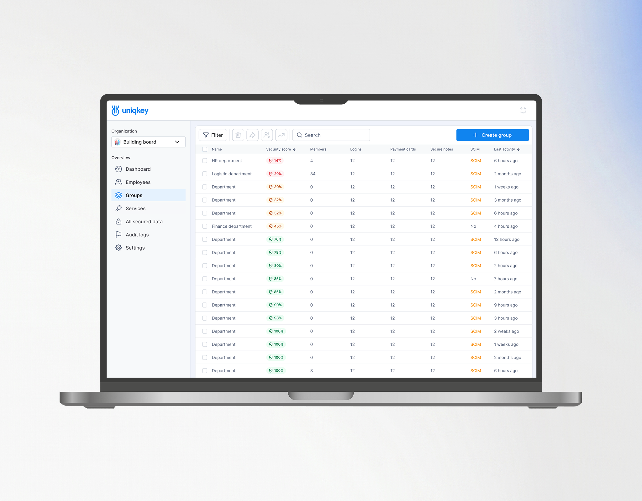
Admin Portal
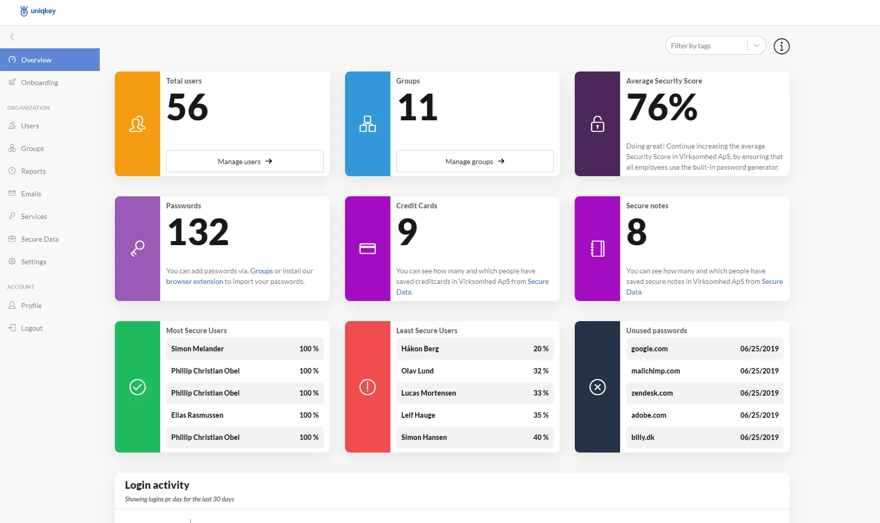
A unified table view for monitoring security scores and activity across all groups. The toolbar enables quick management actions, and clicking any row opens a detailed view of that group.


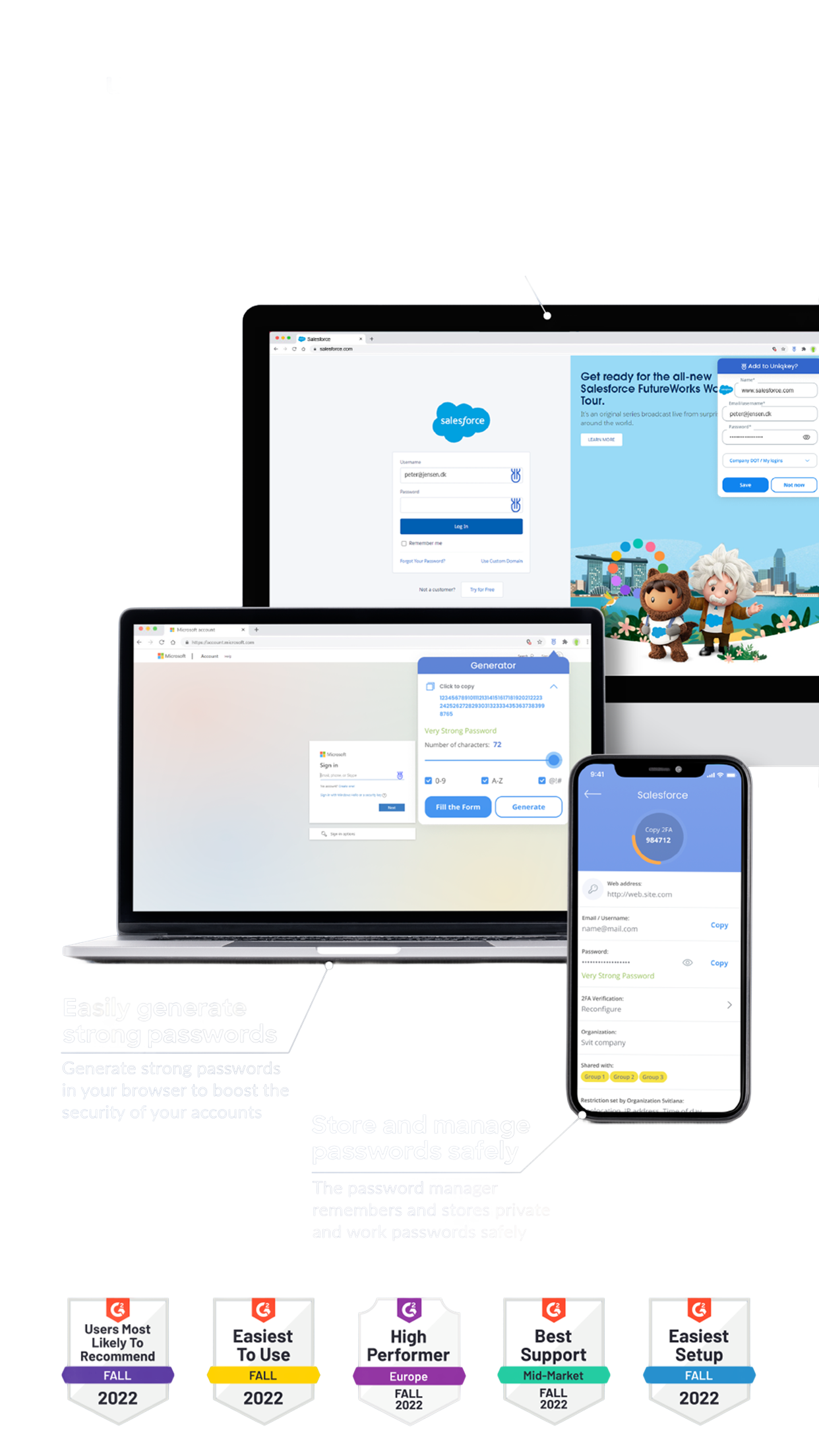
Password manager
Admin UX
Enterprise Security
B2B SaaS
4 Platforms
From Numbers
To Decisions.
I redesigned the Admin Portal — building a connected
system of dashboards, data tables, and navigation that
made the organizational security legible for the first time.
IMPACT:
26%
Satisfaction
Score
95%
Found nav
improved
85%
Security Score
understood
27%
Support
tickets
Product SCOPE
Admin portal
Extension and Mobile App
Partner Portal


9:41
This case study centers on the Admin Portal, the core of Uniqkey’s management experience.
In my role as Lead Designer, I worked across a global ecosystem of platforms, ensuring consistency for the:
This is the story of
Admin portal
Dashboard evolution.
⚠️
The CHALLENGE
Admins couldn't understand their organization's security posture without manual investigation across multiple disconnected screens.
Context — Uniqkey's Admin Panel was the product's most critical decision-making surface.
Enterprise IT admins — in governments, financial institutions, leading European corporations — used it daily to manage organizational security.
The Average Security Score existed as a single number. No one understood where it came from, what affected it, or what to do about it.
Users were confused. The business couldn't see why.
That's why the redesign was initiated.
first-gen
Dashboard
Different roles,
One unified feedback
Compliance Officer
“ I don’t fully understand how to improve the Average Security score. The UI doesn’t provide clear guidance on how to enhance these metrics.”

Systems Administrator
“ Relevant information is not always visible on
the dashboard. More customization is needed
to display data by company priorities and roles.”

Operations Manager
“ The dashboard widgets appear too bulky, making
key information harder to perceive. Data configuration is also challenging, and setup takes longer than expected.”

HR Manager
“ The admin panel is quite complex, taking a lot
of time to manage employees and service access. More intuitive settings would be appreciated.”
HOW I
APPROACHED IT
Working closely with the Product Owner and incorporating insights
and strategic clarifications from the Chief Product Officer, I built
the information architecture and user flows from scratch.
I mapped out how data moved between screens and
how ach layer contributed to the overall security picture.
The underlying logic was presented to and validated
by the business team.
REDESIGNED
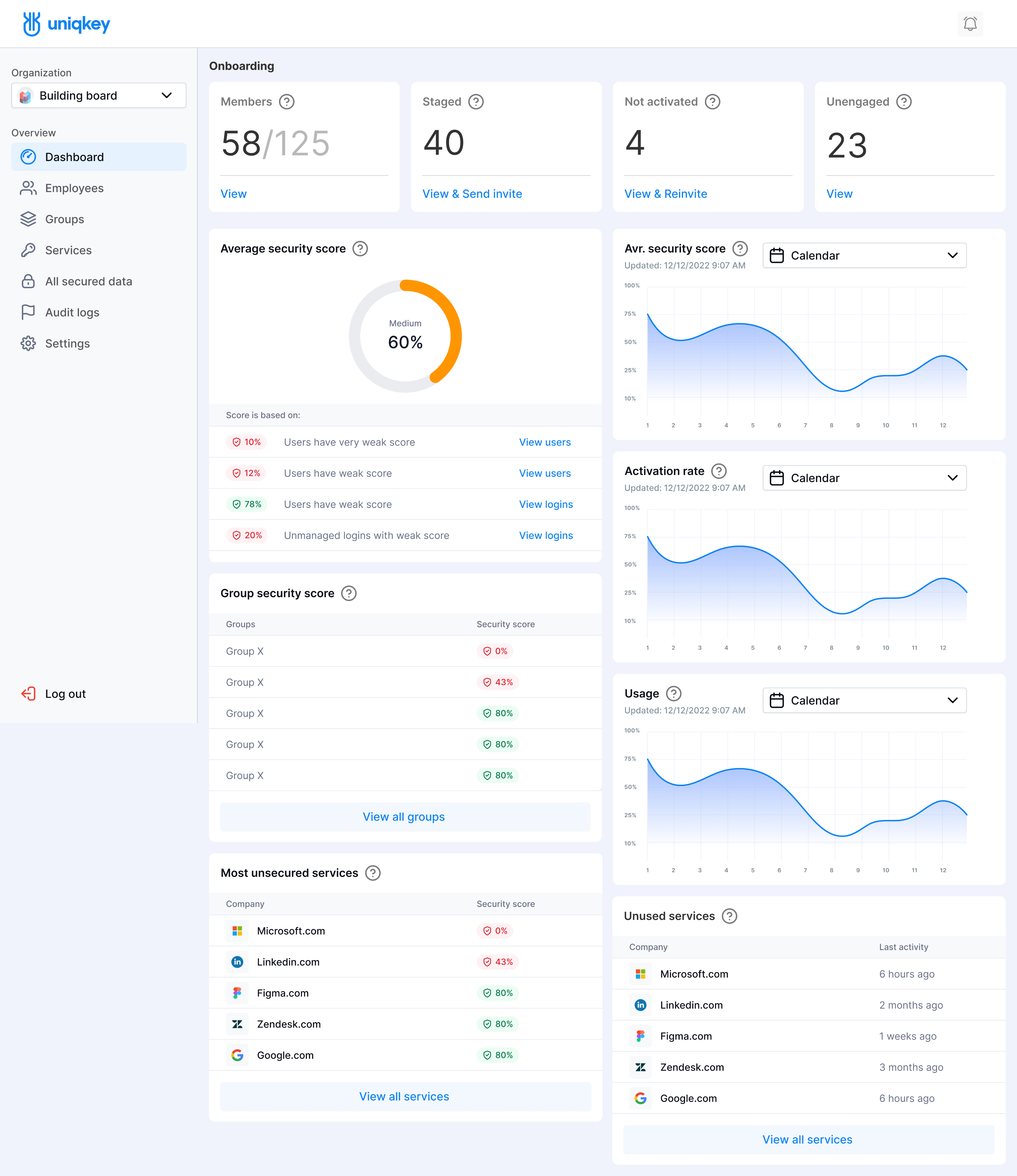
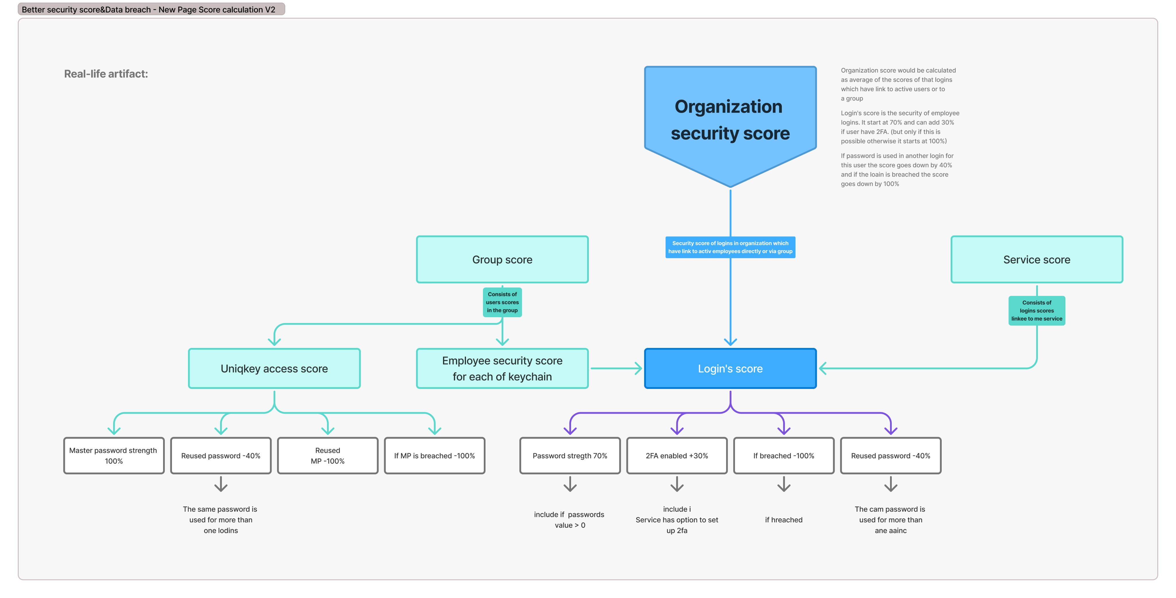
AVERAGE SECURITY SCORE
A main issue - just a single score number.
Admins either ignore it or are anxious about it.
Before: First Gen

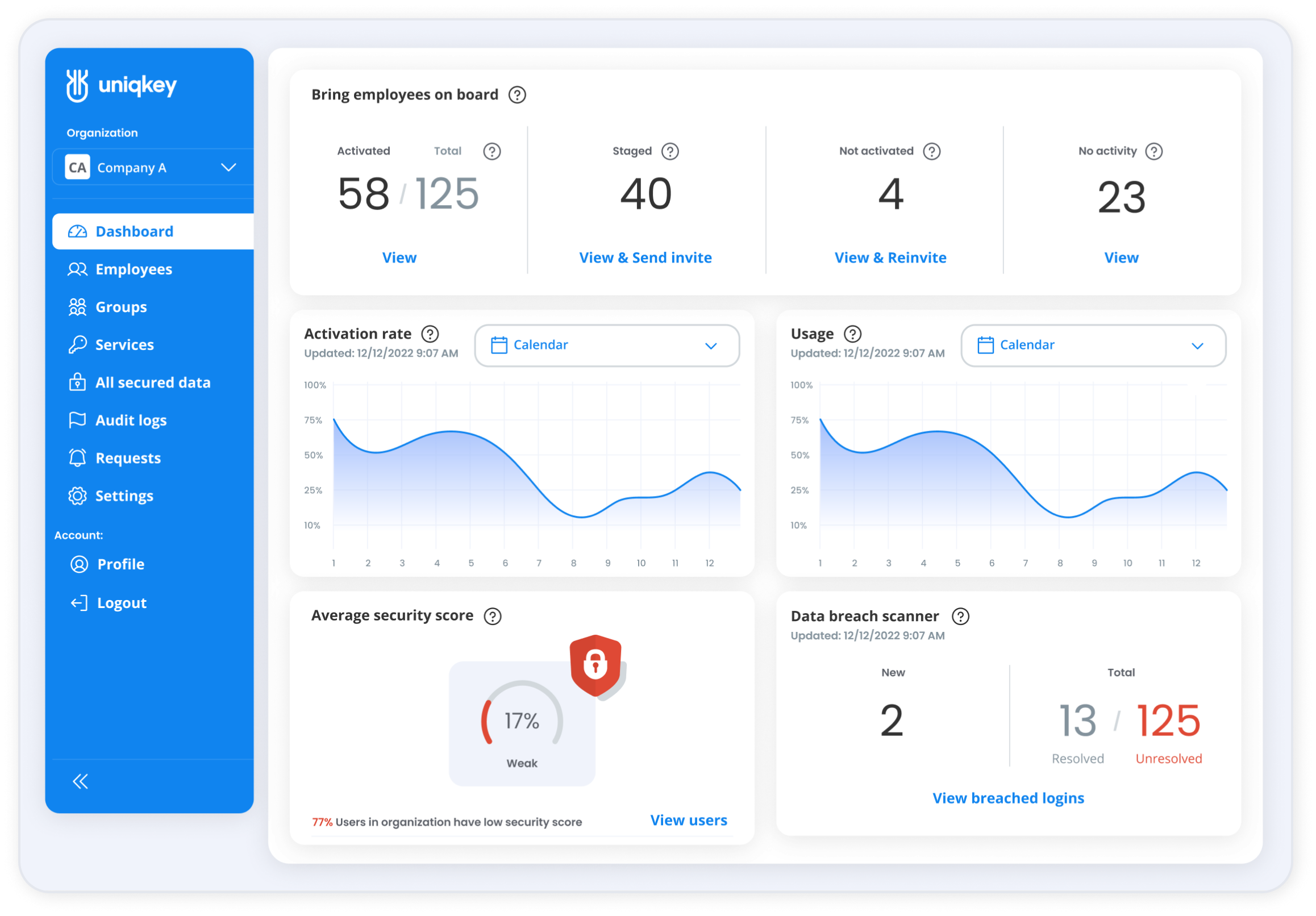
ITERATION: 1
Average security score


17%


Weak

View logins
24% Logins in organization are with low security score
View users
10% Users in organization have low security score
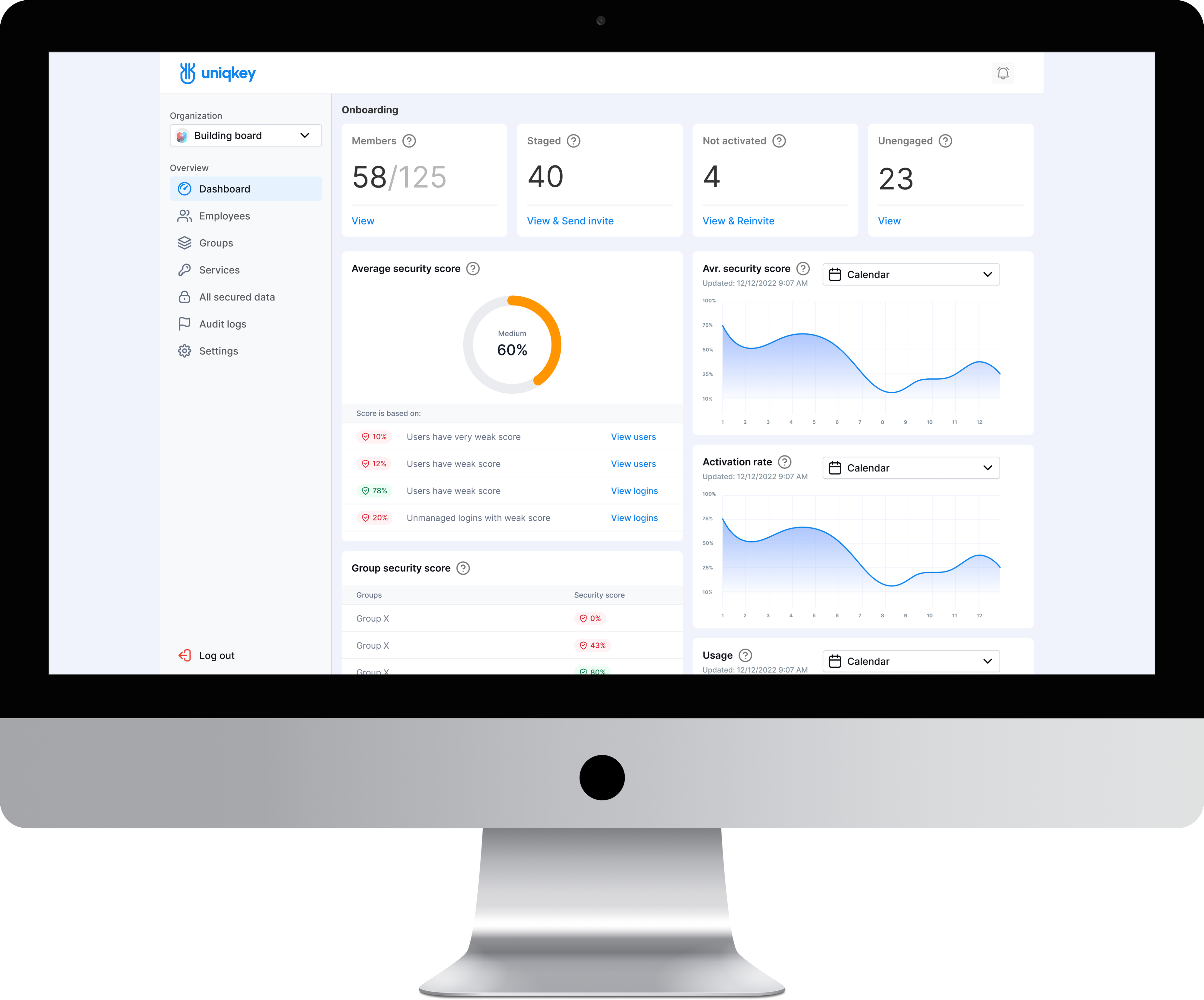
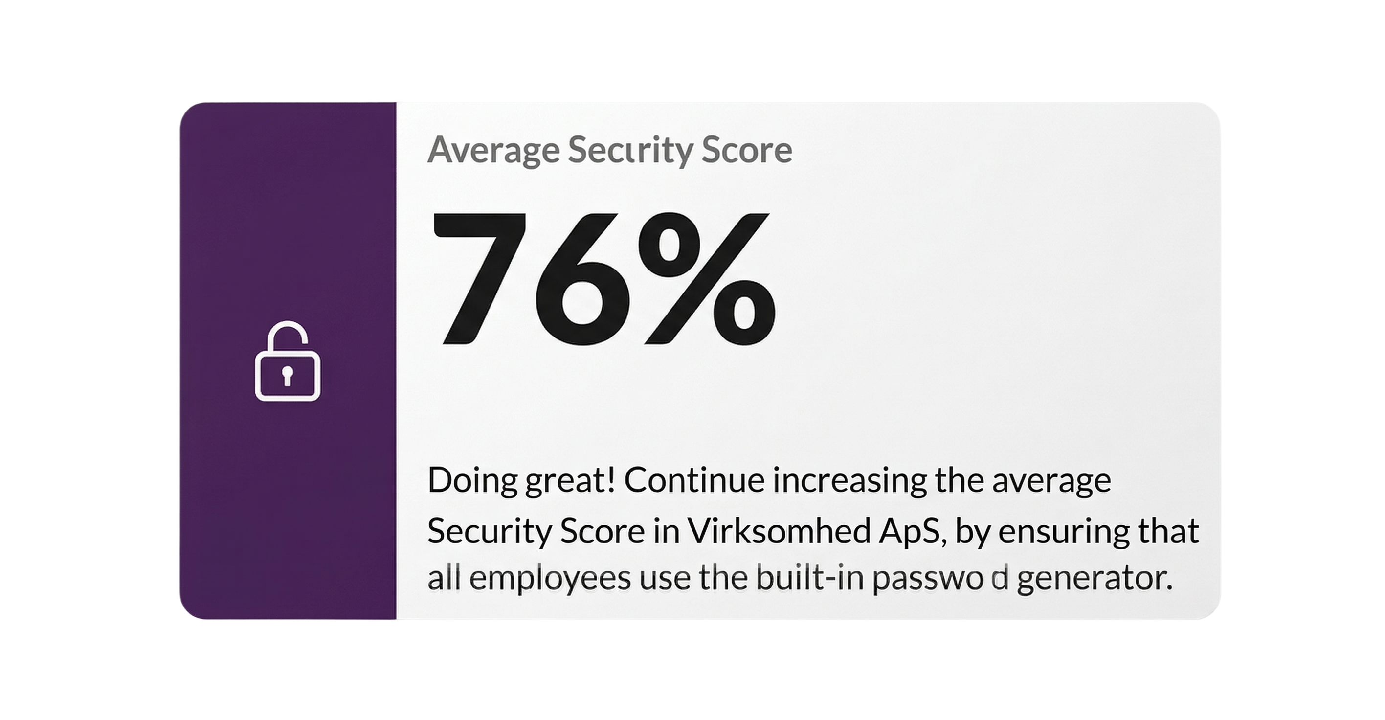
ITERATION: 2
Average security score


Medium
60%
Score is based on:

10%
12%

78%
20%
Users have very weak score
Users have weak score
Users have weak score
Unmanaged logins with weak score
View users
View users
View logins
View logins
The Score is now
a connected indicator:
Organisation-level overview Shows current security health and trend direction. Employee breakdown Which team members affect the score and how navigable directly from the dashboard.
Data items breakdown Which passwords, cards, or secure notes create risk weak, reused, missing 2FA. Direct action paths from every insight to the relevant management screen one click.
THE SHIFT
The redesign wasn't about aesthetics. It was about making the system explain itself, enabling intuitive navigation and confident organization management.
The admin no longer asks "what does this number mean?".
They choose, "Which of these do I fix first?". That's the shift!
REDESIGNED 1/2
ADMIN DASHBOARD
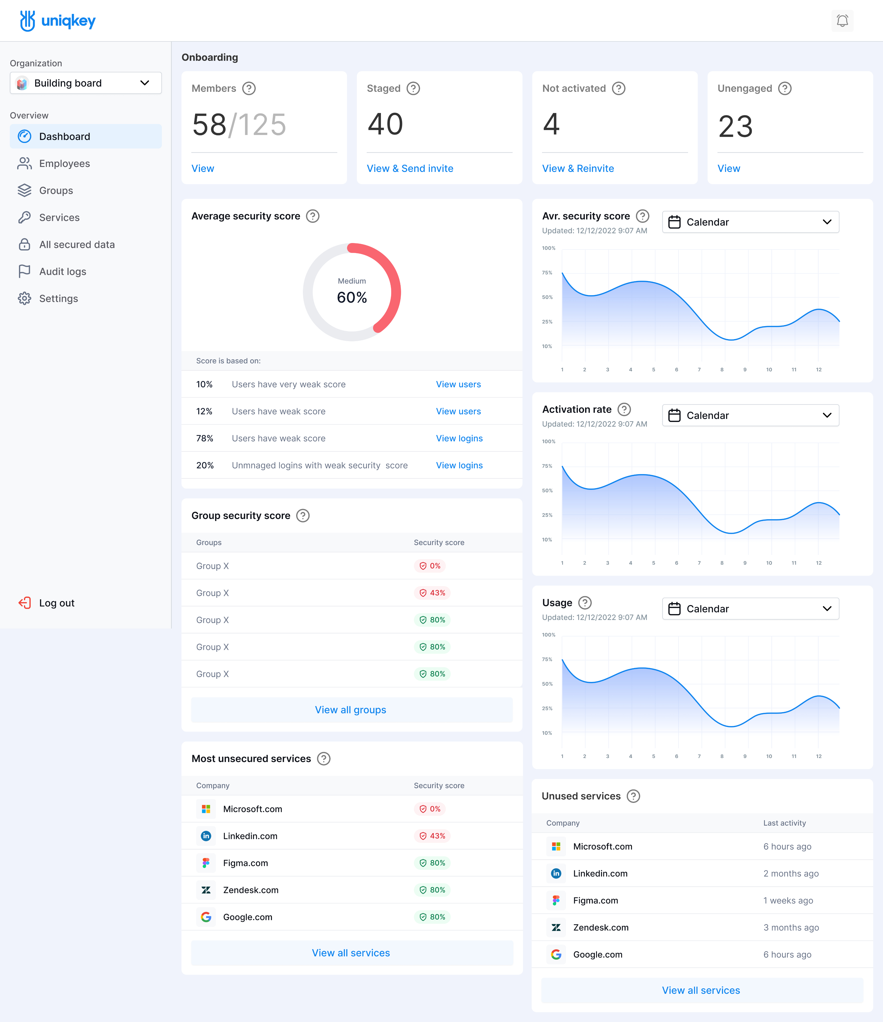
The new dashboard is the entry point to organizational security designed around one question: "What does my organization's security look like right now — and what needs my attention?"
KEY CHANGES
Security Score
Now explainable The score is no longer
a black box. Admins see which factors drive it and can navigate directly
to the source.
Navigation
Always oriented Admins always know where they are, what they're looking at, and how to get back. Previously, users got lost. Now the system guides them.
Information hierarchy
Decision-first Critical alerts surface immediately. Secondary data is accessible but doesn't compete for attention..
REDESIGNED 2/2
ADMIN DASHBOARD
After Iteration 1: Navigation improved, but the visual system still felt overly consumer-oriented for enterprise buyers—such as governments and financial institutions—who expect a more formal, restrained aesthetic. Not a rebrand, but just a recalibration for the audience.
THE SHIFT
From: rounded elements, vibrant colors, visual noise
To: sharp geometry, muted palette, refined typography, reduced decoration
The result: an interface that enterprise clients describe as professional and trustworthy — before they read a single data point.
BUSINESS IMPACT
The product update contributed to 35% annual revenue growth — alongside the efforts of sales, marketing,
and the broader team. Design was one of the inputs,
not the only one.
The product expanded beyond Scandinavia into new European markets and was featured at international cybersecurity summits.
Other Screens
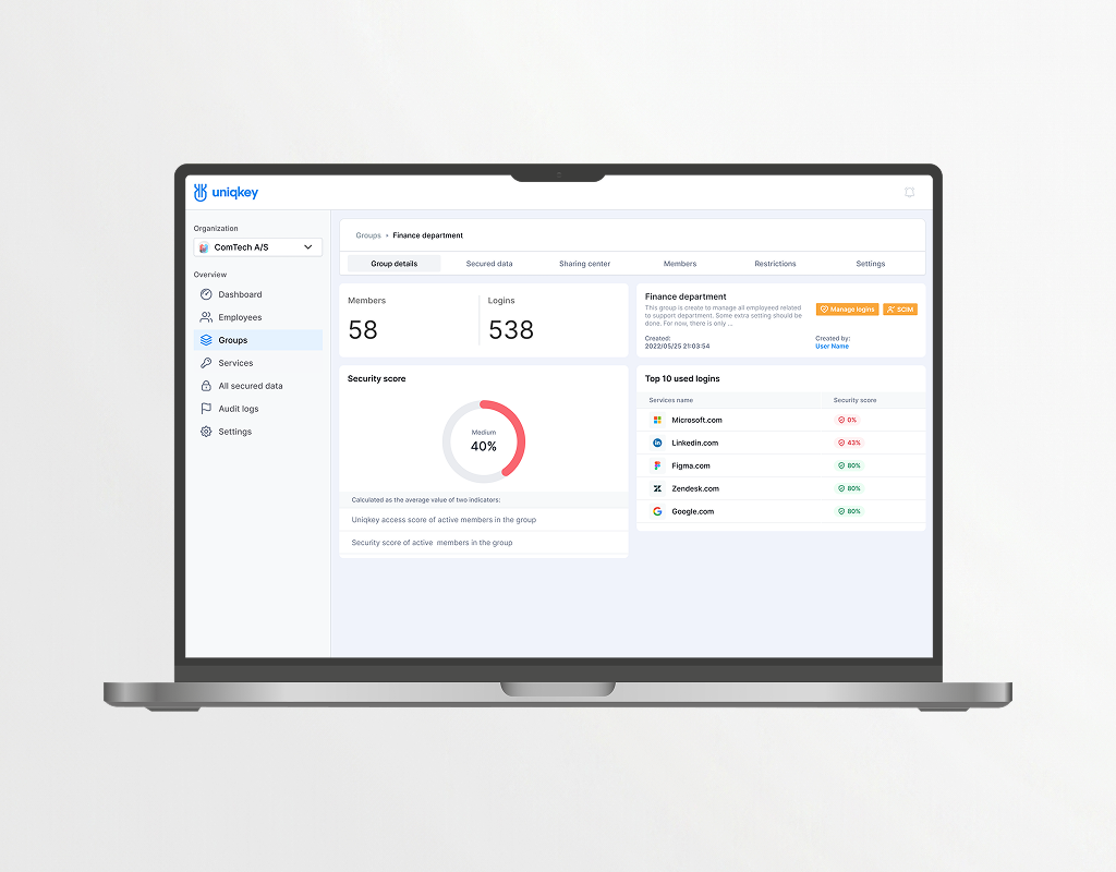
A unified table view for monitoring security scores and activity across all groups. The toolbar enables quick management actions, and clicking any row opens a detailed view of that group.
A detailed group view with key metrics, member count, login usage, and security score, organized across tabs for easy navigation. The same consistent layout
is applied across both groups and employees.
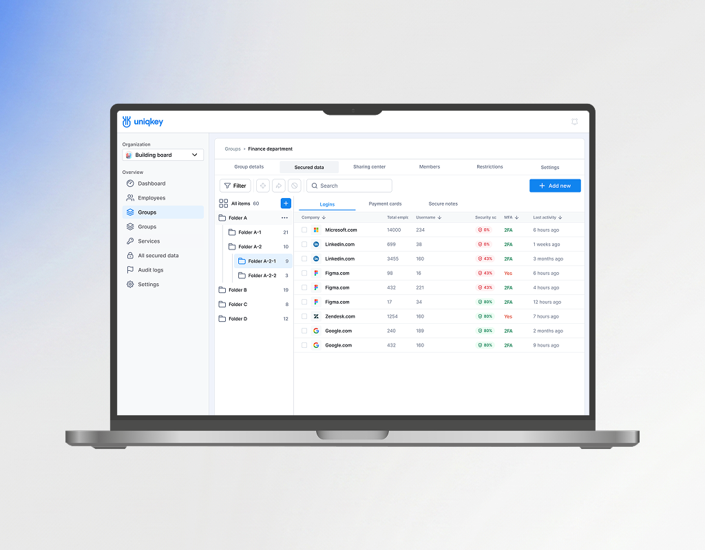
A centralized view of shared company logins, organized into groups and folders for easier access management. Structured permissions allow admins
to control visibility by department or
role, so employees only see credentials relevant to their work.
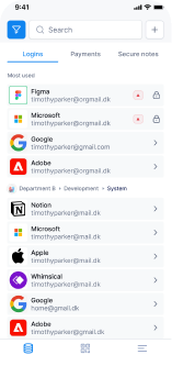
A mobile home screen with saved logins organized into tabs and department folders for faster navigation. Selecting
a login opens full credentials, 2FA, sharing details, and quick actions, giving
users everything they need in one place.
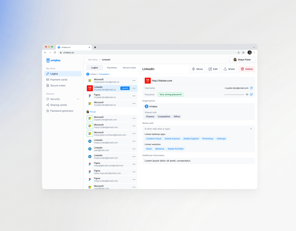
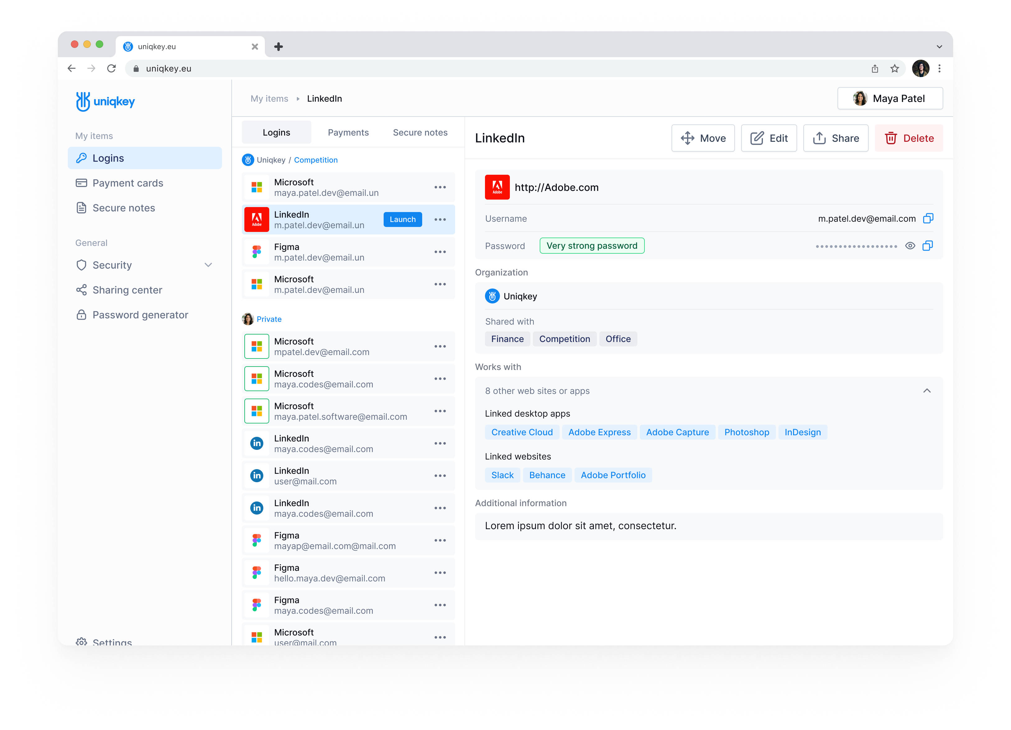
For secure access to company credentials, payments, and notes, synchronized with the mobile app for seamless authentication. The interface enables quick login actions, secure password management, advanced filtering, and realtime security monitoring in a compact, accessible workflow.
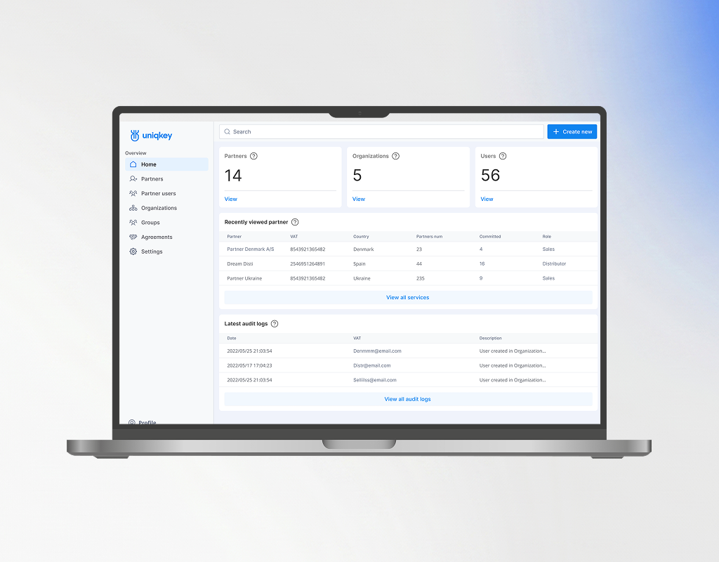
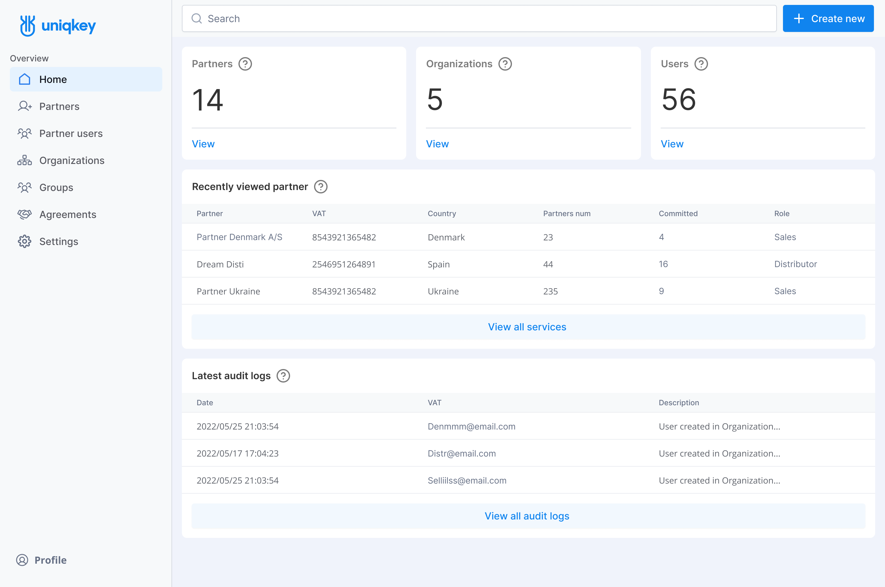
A centralized dashboard for managing partners, organizations, and license distribution across the ecosystem.
The interface provides quick access
to key metrics, detailed partner views, and organization management, streamlining product distribution
and access control in one place.
Product Awards at That Time.
DESIGN SYSTEM
The Admin Portal was the foundation for everything that followed. As the system scaled across platforms, I transitioned our UI Kit into a token-based Design System —making the case that the investment would compound on every future feature.
Foundation layer:
Component library:
Development integration:
Live Design Files:
Prototype:
Dashboard prototypeDesign System:
Components, styles, and tokens
Reviews:


Sanne Øst
Chief Product Officer
Roman is a very creative person. We worked together on the design of a password management application and came up with a great solution that was successfully launched. Roman loves
to research the market and is always full of creative ideas. If you need fresh and unique eye
on your product - Roman is the right person.

View

Ready to architect your next product?
Open for complex challenges and leadership roles.
Select time to call and Hire Me below.
Book a Call


Alien Eyes


© 2026 Roman Sviderskyi
+380 97 334 9540 / svidddrommm25@gmail.com